Usage
General
Figure construction
General settings like figure size, margins and font size are usually handled automatically by EnergyDiagram, but can be customised at construction.
dia = EnergyDiagram(
    extra_x_margin=(0, 0.5),   # additional margin in x (data units)
    extra_y_margin=(0, 0.2),   # additional margin in y (relative units)
    figsize=(6, 4),            # explicit figure size in inches
    width_limit=7,             # maximum width in inches if figure is scaled automatically (figsize is not set, default: None)
    fontsize=10,               # default font size for all text elements (can be overridden individually)
    style="halfboxed",         # diagram style (see later sections for details)
    dpi=150,                   # resolution in dots per inch for raster formats (ignored for vector formats like PDF, svg and eps)
)
Saving figures
Figures can be saved in any format supported by Matplotlib. The bbox_inches="tight" option is recommended to adjust whitespace around the figure.
dia.fig.savefig("diagram.png", dpi=300, bbox_inches="tight")
dia.fig.savefig("diagram.pdf", bbox_inches="tight")
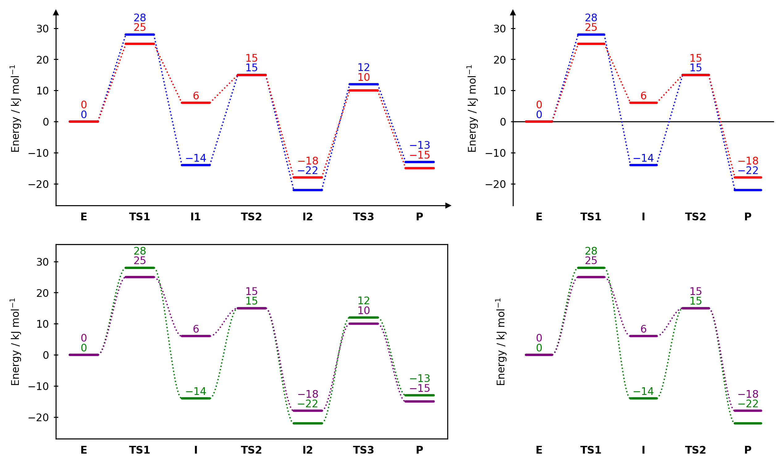
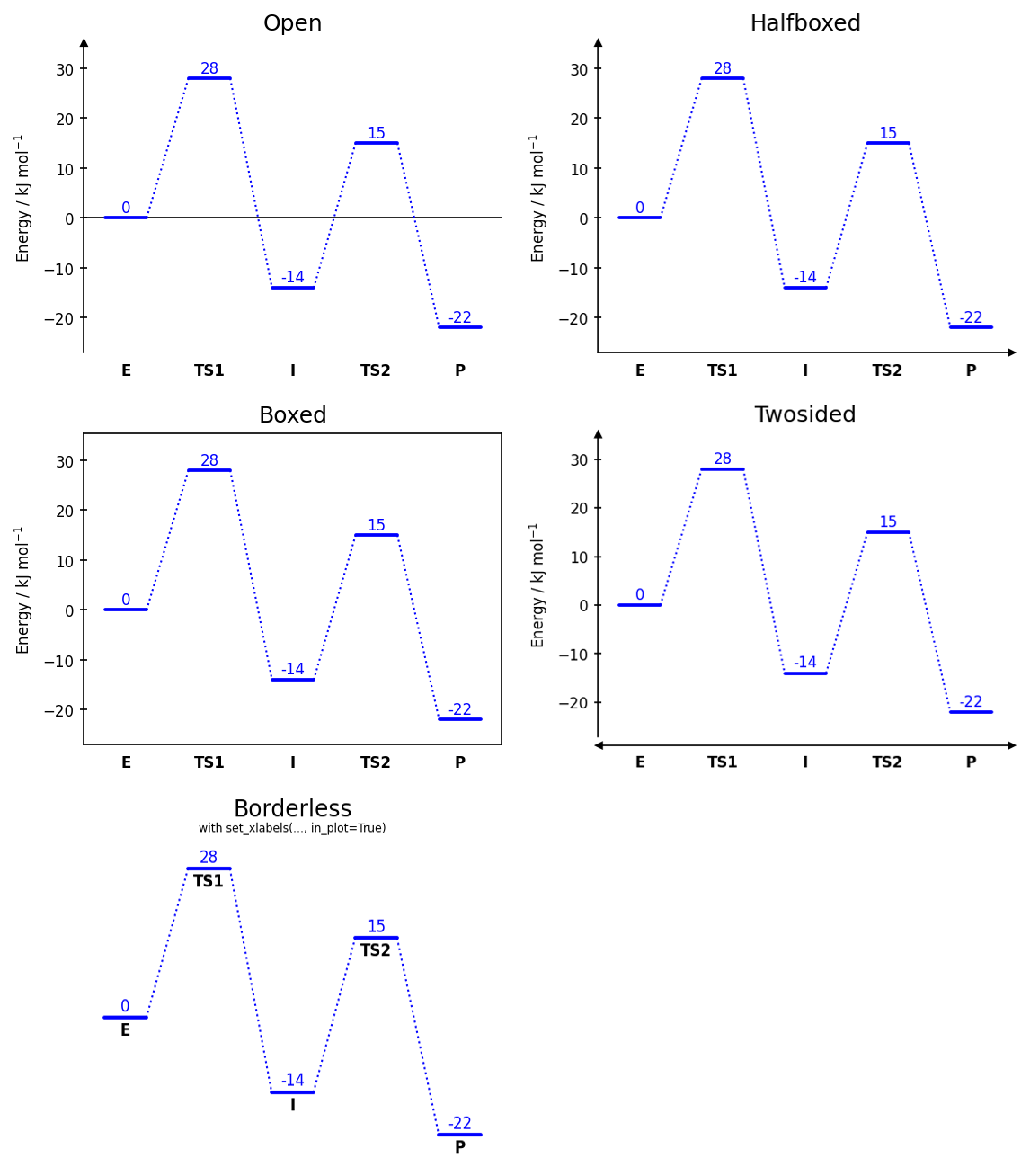
Inserting EnergyDiagram into subplots
EnergyDiagram can be inserted into an existing Matplotlib figure and axes, which allows to combine it with other plot elements or to create multi-panel figures. To do so, pass the target axes to the ax parameter at construction. In this case, however, the automatic figure size scaling of EnergyDiagram is disabled and must be set via the externally created figure.
from chemdiagrams import EnergyDiagram
import matplotlib.pyplot as plt
import os.path

fig, ax = plt.subplots(
    nrows=2,
    ncols=2,
    width_ratios=[1.5, 1],
    figsize=(10,6),
)

dia11 = EnergyDiagram(ax=ax[0][0], style="halfboxed") # Pass target axes to constructor
dia11.draw_path(x_data=[0,1,2,3,4,5,6], y_data=[0,28,-14,15,-22, 12, -13], color="blue")
dia11.draw_path(x_data=[0,1,2,3,4,5,6], y_data=[0,25,6,15,-18, 10, -15], color="red")
dia11.set_xlabels(["E", "TS1", "I1", "TS2", "I2", "TS3", "P"])
dia11.add_numbers_auto()
dia11.ax.set_ylabel("Energy / kJ mol$^{-1}$", fontsize=8)

dia12 = EnergyDiagram(ax=ax[0][1], style="open") # Pass target axes to constructor
dia12.draw_path(x_data=[0,1,2,3,4], y_data=[0,28,-14,15,-22], color="blue")
dia12.draw_path(x_data=[0,1,2,3,4], y_data=[0,25,6,15,-18], color="red")
dia12.set_xlabels(["E", "TS1", "I", "TS2", "P"])
dia12.add_numbers_auto()
dia12.ax.set_ylabel("Energy / kJ mol$^{-1}$", fontsize=8)

dia21 = EnergyDiagram(ax=ax[1][0], style="boxed") # Pass target axes to constructor
dia21.draw_path(x_data=[0,1,2,3,4,5,6], y_data=[0,28,-14,15,-22, 12, -13], color="green", linetypes=3)
dia21.draw_path(x_data=[0,1,2,3,4,5,6], y_data=[0,25,6,15,-18, 10, -15], color="purple", linetypes=3)
dia21.set_xlabels(["E", "TS1", "I", "TS2", "I2", "TS3", "P"])
dia21.add_numbers_auto()
dia21.ax.set_ylabel("Energy / kJ mol$^{-1}$", fontsize=8)

dia22 = EnergyDiagram(ax=ax[1][1], style="borderless") # Pass target axes to constructor
dia22.draw_path(x_data=[0,1,2,3,4], y_data=[0,28,-14,15,-22], color="green", linetypes=3)
dia22.draw_path(x_data=[0,1,2,3,4], y_data=[0,25,6,15,-18], color="purple", linetypes=3)
dia22.set_xlabels(["E", "TS1", "I", "TS2", "P"])
dia22.add_numbers_auto()
dia22.ax.set_ylabel("Energy / kJ mol$^{-1}$", fontsize=8)

fig.savefig(os.path.join("..","docs","img","example_subplots.png"),format="png", bbox_inches="tight", dpi=300)
plt.show()
Path-related methods
Drawing paths
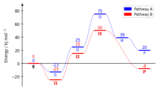
Each call to draw_path adds one reaction pathway. Paths can span different x-ranges, allowing branching or incomplete pathways.
dia = EnergyDiagram()

dia.draw_path(
    x_data=[0, 1, 2, 3, 4, 5],
    y_data=[0, -13, 22, 75, 39, 20],
    color="blue",
    path_name="Pathway A",      # name appears in the legend
    linetypes=[2, 3, 4, -1, 0], # connector style per segment
)

dia.draw_path(
    x_data=[0, 1, 2, 3, 5],
    y_data=[0, -25, 20, 50, 6],
    color="red",
    path_name="Pathway B",
)

dia.legend(fontsize=7)
dia.add_numbers_auto()
dia.set_xlabels(["A", "B", "C", "D", "E", "F"])
dia.ax.set_ylabel("Energy / kJ mol$^{-1}$", fontsize=8)

dia.fig.savefig(os.path.join("..","docs","img","example_multipaths.png"),format="png", bbox_inches="tight")
dia.show()
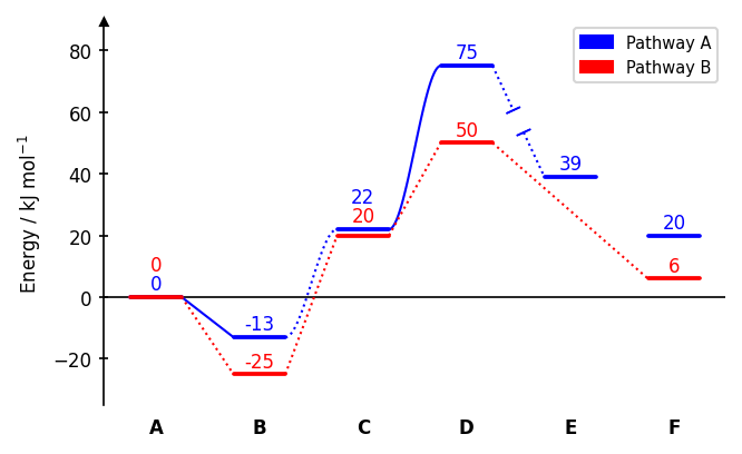
Connector styles (linetypes):
| Value | Style |
|---|---|
0 |
no connector |
1 |
dotted line (default) |
-1 |
dotted line with gap |
2 |
solid line |
-2 |
solid line with gap |
3 |
dotted cubic spline |
-3 |
dotted cubic spline with gap |
4 |
solid cubic spline |
-4 |
solid cubic spline with gap |
A single integer applies the same style to all segments. A list applies styles individually.
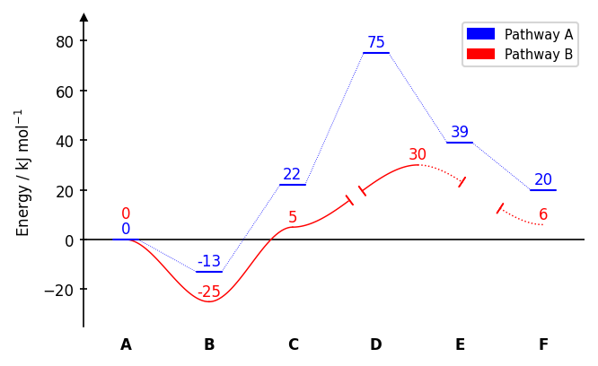
The width of a plateau can be adjusted with the keyword width_plateau. It can be a float in data units (Default is 0.5). Furthermore, the linewidth of the plateaus can be set via lw_plateau to one of the strings "plateau" or "connector" to refer to predefined values or a number. Also the linewidth of the connectors can be set via lw_connector. The gap of broken line styles can be adjusted with gap_scale, which is a scaling factor for the gap size (default is 1). It can be a single number applied to all segments, or a sequence with one value per segment. Example:
dia = EnergyDiagram()

dia.draw_path(
    x_data=[0, 1, 2, 3, 4, 5],
    y_data=[0, -13, 22, 75, 39, 20],
    color="blue",
    path_name="Pathway A",
    width_plateau=0.3,
    lw_plateau="connector",
    lw_connector=0.4,
)

dia.draw_path(
    x_data=[0, 1, 2, 3.5, 5],
    y_data=[0, -25, 5, 30, 6],
    color="red",
    path_name="Pathway B",
    linetypes=[4, 4, -4, -3],
    width_plateau=0,
    lw_connector=0.7,
    gap_scale=[0,0, 0.5, 1.5],
)

dia.add_numbers_auto()
dia.legend(fontsize=7)
dia.set_xlabels(["A", "B", "C", "D", "E", "F"])
dia.ax.set_ylabel("Energy / kJ mol$^{-1}$", fontsize=8)

dia.show()
Merging degenerate plateaus
When two paths share the same energy level at the same x-position, merge_plateaus
replaces both full-width bars with two shorter half-bars separated by a gap, with
diagonal tick marks to indicate degeneracy.
dia = EnergyDiagram(style="twosided")
dia.draw_path(x_data=[0, 1, 2], y_data=[10, 55, 0], color="blue", path_name="Path A")
dia.draw_path(x_data=[2, 3, 4], y_data=[0, 50, -5], color="red",  path_name="Path B")

# Both paths share y=0 at x=2
dia.merge_plateaus(
    x=2,                        # x-position of the shared plateau in data coordinates
    path_name_left="Path A",    # name of the left path to merge (must match the path_name used in draw_path)
    path_name_right="Path B",   # name of the right path to merge (must match the path_name used in draw_path)
    gap_scale=1.0,              # width of the gap between the two half-bars
    stopper_scale=1.0,          # size of the diagonal tick marks
    angle=30,                   # angle of the tick marks in degrees
)

dia.add_numbers_auto()
dia.set_xlabels(["P1", "TS1", "E", "TS2", "P2"])
dia.ax.set_ylabel("Energy / kJ mol$^{-1}$", fontsize=8)

dia.fig.savefig(os.path.join("..","docs","img","example_merge_plateaus.png"),format="png", bbox_inches="tight")
dia.show()
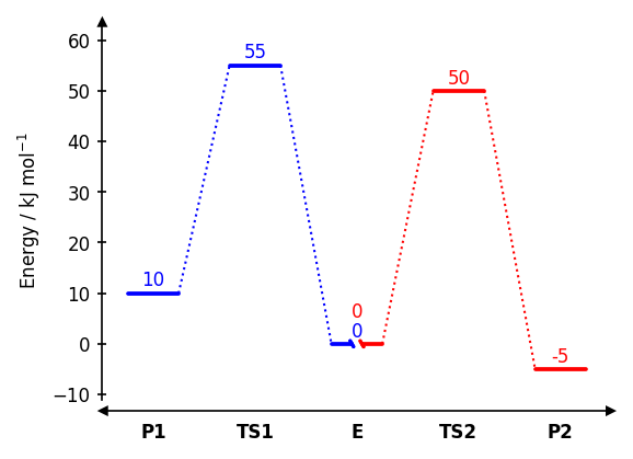
Both paths must already be drawn and must have exactly the same y-value at x.
Path labels
Text labels can be added for each path at each position with add_path_labels. This is useful to label specific states along a pathway.
dia.add_path_labels(
    "Pathway A",                        # Name of the path, for which the labels are to be added
    ["A", "B", "C", "D", None, "F"],    # Labels for the path, None can be used to not display a label at a specific position
    fontsize=6,                         # Font size for the labels (uses diagram default if None)
    color="black",                      # Color for the labels (uses diagram default if None)
    weight="bold"                       # Font weight for the labels (uses "normal" if None)
    rotation=0                          # Rotation angle for the labels in degrees (default is 0)
)
Example:
dia = EnergyDiagram()

dia.draw_path(
    x_data=[0, 1, 2, 3, 4, 5],
    y_data=[0, -13, 25, 75, 39, 20],
    color="blue",
    path_name="Pathway A",
    linetypes=3,                # connector style for all segments as an int
)

dia.draw_path(
    x_data=[0, 1, 2, 3, 5],
    y_data=[0, -25, 15, 50, -8],
    color="red",
    path_name="Pathway B",
    linetypes=3
)

dia.add_path_labels(
    "Pathway A",
    [None, "I1", "I2", "I3", "I4", "P"], # None for no label
    fontsize=7,
)

dia.add_path_labels(
    "Pathway B",
    ["E", "I1", "I2", "I3", "P"],
    weight="bold"
)
dia.lines["Pathway B"].labels["0.0"].set_color("black") # Set the color of the first label of Pathway B to black

dia.legend(fontsize=7)
dia.add_numbers_auto()
dia.ax.set_ylabel("Energy / kJ mol$^{-1}$", fontsize=8)

dia.fig.savefig(os.path.join("..","docs","img","example_path_labels.png"),format="png", bbox_inches="tight")
dia.show()
Style-related methods
Diagram styles
dia.set_diagram_style("halfboxed") # open | halfboxed | boxed | twosided | borderless
The style can be set at construction via EnergyDiagram(style="boxed") or changed afterwards with set_diagram_style.
X-axis labels
By default labels are placed below the x-axis:
dia.set_xlabels(["A", "TS", "B"], fontsize=8, weight="normal")
The weightand colorkeywords can be used to set the font weight and color of the x-axis labels.
dia.set_xlabels(["A", "TS", "B"], weight="normal", color="red")
Pass in_plot=True to render them inside the plot area, directly below the lowest energy state.
dia.set_xlabels(["A", "TS", "B"], in_plot=True)
Use labelplaces to set explicit x-coordinates instead of the default sequential placement:
dia.set_xlabels(["A", "TS", "B"], labelplaces=[0, 2, 3])
The rotation keyword can be used to set the rotation angle of the x-axis labels in degrees.
dia.set_xlabels(["A", "TS", "B"], rotation=45)
Axis breaks
Axis breaks can be added to either axis to indicate a discontinuity in the scale. The break is drawn at the specified x or y position in data coordinates, with a gap in the axis line and diagonal tick marks.
dia = EnergyDiagram(style="twosided")
dia.draw_path(x_data=[0,1,2,3,4,5], y_data=[0,-13,22,75,39,-25], color="blue")

dia.add_yaxis_break(y=5)
dia.add_xaxis_break(
    x=2,                        # x-position of the break in data coordinates
    gap_scale=2,                # scaling factor for the gap in the axis line (default: 1)
    stopper_scale=1.5,          # scaling factor for the size of the stopper tick marks (default: 1)
    angle=60,                   # angle of the stopper tick marks in degrees (default: 60)
)
dia.set_xlabels(["A", "B", "C", "D", "E", "F"])
dia.add_numbers_auto()
dia.ax.set_ylabel("Energy / kJ mol$^{-1}$", fontsize=8)

dia.fig.savefig(os.path.join("..","docs","img","example_breaks.png"),format="png", bbox_inches="tight")
dia.show()
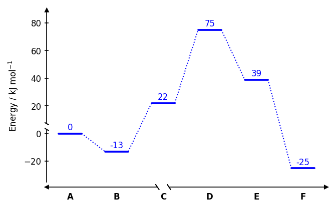
Note: x-axis breaks are not compatible with the "open" and "borderless" styles. y-axis breaks are not compatible with the "borderless" style.
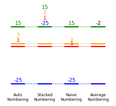
Numbering
Numbering styles
Four numbering strategies are available. Call them after all paths have been drawn.
dia.add_numbers_auto()                   # distributes labels to avoid overlaps (recommended)
dia.add_numbers_stacked()                # stacks all labels above the highest state
dia.add_numbers_naive()                  # places each label directly above its bar
dia.add_numbers_average()                # displays the mean energy across all paths
To restrict the numbering to a specific range of x-values, pass x_min_max=(x_min, x_max) to the numbering method.
dia.add_numbers_auto(x_min_max=(1, 4))
To exclude numbers for a specific path, pass show_numbers=False to draw_path for that path.
dia.draw_path(..., show_numbers=False)
It is possible to adjust the fontsize of the numbers via the fontsize parameter of the numbering methods, or by direct Matplotlib access after drawing (see below).
dia.add_numbers_auto(..., fontsize=6)
All numbers are automatically rounded to integers by default. The number of decimal places can be manually set with the n_decimals parameter of the numbering methods.
dia.add_numbers_auto(..., n_decimals=2)
For add_numbers_average, the color of the labels can be set with the color parameter.
dia.add_numbers_average(color="red")
Example:
dia = EnergyDiagram(style="borderless", figsize=(3,2))

dia.draw_path(
    x_data=[0, 1, 2, 3],
    y_data=[1, 1, 1, 1],
    color="red",
)
dia.draw_path(
    x_data=[0, 1, 2, 3],
    y_data=[-25, -25, -25, -25],
    color="blue",
)
dia.draw_path(
    x_data=[0, 1, 2, 3],
    y_data=[15, 15, 15, 15],
    color="green",
)
dia.draw_path(
    x_data=[0, 1, 2, 3],
    y_data=[3, 3, 3, 3],
    color="orange",
)

dia.add_numbers_auto(x_min_max=0)
dia.add_numbers_stacked(x_min_max=1)
dia.add_numbers_naive(x_min_max=2)
dia.add_numbers_average(x_min_max=3, color="black")

dia.set_xlabels([
    "Auto\nNumbering",
    "Stacked\nNumbering",
    "Naive\nNumbering",
    "Average\nNumbering"
],
    fontsize=6,
    weight="normal"
)

dia.fig.savefig(os.path.join("..","docs","img","example_numbering.png"),format="png", bbox_inches="tight")
dia.show()
Displaying activation energy barriers
display_activation_barriers() replaces existing energy annotations with activation energy barriers. It calculates the energy difference between a state and its preceding intermediate at given x-positions and replaces the existing number with the calculated energy difference. display_activation_barriers() takes a list of x-positions and a direction parameter that specifies whether to calculate the energy difference to the preceding state in -x direction (direction="right"), the following state in +x direction (direction="left") or both (direction="both").
display_activation_barriers(
        x_positions=[1, 3],         # list of x-positions in data coordinates for which to display activation barriers
        direction="both",           # direction to calculate the energy difference ("right", "left" or "both")
        include_paths=None,         # list of path names to include in the calculation; None to include all paths,
        exclude_paths=None,         # list of path names to exclude from the calculation; None includes all paths
        brackets=("(", ")"),        # pair of strings to add as brackets around the modified number (e.g. ("[", "]"); None for no brackets)
        seperator="/",              # string to separate the forward and backward activation energy when direction="both" (default is "/")
        n_decimals=0,               # number of decimals to round the calculated energy differences to (default is 0)
        switch_order=False,         # switch the order of the energy differences in case of direction="both"
        append_to_existing=False,   # append the activation energy to the existing number instead of replacing it (default is False)
)
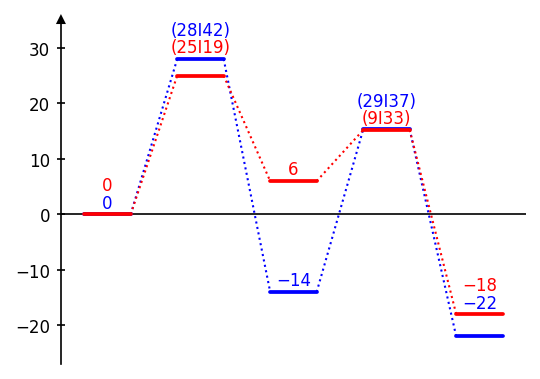
Example:
dia = EnergyDiagram()

dia.draw_path(
    x_data=[0, 1, 2, 3, 4],
    y_data=[0, 28, -14, 15.3, -22],
    color="blue",
    path_name="Blue path",
)

dia.draw_path(
    x_data=[0, 1, 2, 3, 4],
    y_data=[0, 25, 6, 15.2, -18],
    color="red",
    path_name="Red path",

)

dia.add_numbers_auto()
dia.display_activation_barriers(
    x_positions=[1,3],
    direction="both",
    brackets=("(", ")"),
    seperator="I",
)

dia.fig.savefig(os.path.join("..","docs","img","example_activation_barriers.png"),format="png", bbox_inches="tight")
dia.show()
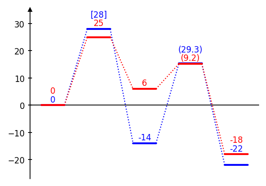
Modifying existing numbers
Existing energy annotations can be modified by adding or subtracting values with modify_number_values(). This is useful to annotate energy differences (e.g., activation energies or reaction energies) by subtracting the relevant reference energy from the target energy. The resulting number is caclulated for each path as follows:
base_value + sum(energies at x_add) - sum(energies at x_subtract)
dia.modify_number_values(
    x=2,                        # x-position of the number to modify in data coordinates
    x_add=[2],                  # list of x-positions (or single x-position) to add to the number; None for no addition
    x_subtract=[1],             # list of x-positions (or single x-position) to subtract from the number; None for no subtraction
    base_value=0,               # value to add or subtract directly (e.g., to convert units); default is 0
    brackets=("(", ")"),        # pair of strings to add as brackets around the modified number (e.g., ("[", "]"); None for no brackets)
    n_decimals=0,               # number of decimals to round the modified number to (default is 0)
    include_paths=None,         # list of path names to include in the modification; None to include all paths
    exclude_paths=None,         # list of path names to exclude from the modification; None includes all paths
    n_decimals=0,               # number of decimals to round the modified number to (default is 0)
    append_to_existing=False,   # append the modified value to the existing number instead of replacing it (default is False)
)
Example:
dia = EnergyDiagram()

dia.draw_path(
    x_data=[0, 1, 2, 3, 4],
    y_data=[0, 28, -14, 15.3, -22],
    color="blue",
    path_name="Blue path",
)

dia.draw_path(
    x_data=[0, 1, 2, 3, 4],
    y_data=[0, 25, 6, 15.2, -18],
    color="red",
    path_name="Red path",
)

dia.add_numbers_auto()

dia.modify_number_values(
    x=1,
    x_add=1,
    x_subtract=0,
    include_paths=["Blue path"],
    brackets=("[", "]"),
)

dia.modify_number_values(
    x=3,
    x_add=[3],
    x_subtract=[2],
    n_decimals=1,
)

dia.fig.savefig(os.path.join("..","docs","img","example_number_modification.png"),format="png", bbox_inches="tight")
dia.show()
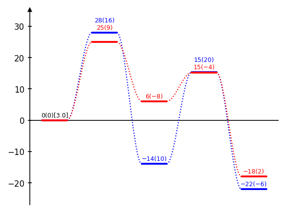
Multiple numbers per label (appending to energy labels)
append_to_energy_labels allows to append additional numbers to the existing energy labels for each path. This is useful for displaying multiple energy values (e.g., electronic energy and dispersion energy) for each state. To achieve this, first use a number placement method (e.g., add_numbers_auto) and then append the second set of values with append_to_energy_labels.
...
draw_path(path_name="Path A", ...)
draw_path(path_name="Path B", ...)
add_numbers_auto(xmin_max=(1,3))
add_numbers_average(x_min_max=0)

dia.append_to_energy_labels(
    numbers_to_append={
        "Path A": [16, 10, 20],   # list of numbers to append for each state of Path A
        "Path B": [9, -8, -4],    # list of numbers to append for each state of Path B
        "Average": [0],           # list of numbers to append for the average label (if add_numbers_average was used)
    },
    brackets=("[", "]"),          # pair of strings to add as brackets around the appended number; None for no brackets
    n_decimals=0,                 # number of decimals to round the appended number to (default is 0)
    infront=False,                # place the appended number in front of the original number instead of behind (default is False)
)
The method append_to_energy_labels can also be used multiple times to append several sets of numbers, which will be added sequentially behind each other.
Example:
dia = EnergyDiagram()

dia.draw_path(
    x_data=[0, 1, 2, 3, 4],
    y_data=[0, 28, -14, 15.3, -22],
    color="blue",
    path_name="Blue path",
    linetypes=3,
)

dia.draw_path(
    x_data=[0, 1, 2, 3, 4],
    y_data=[0, 25, 6, 15.2, -18],
    color="red",
    path_name="Red path",
    linetypes=3,
)

dia.add_numbers_auto(x_min_max=(1,4), fontsize=6)
dia.add_numbers_average(x_min_max=0, fontsize=6)

dia.append_to_energy_labels(
    numbers_to_append={
        "Blue path": [16, 10, 20, -6],
        "Red path": [9, -8, -4, 2],
        "Average": [0]
    },
)

dia.append_to_energy_labels(
    numbers_to_append={
        "Average": [3]
    },
    brackets=("[", "]"),
    n_decimals=1
)

dia.fig.tight_layout()
dia.fig.savefig(os.path.join("..","docs","img","example_append_numbers.png"),format="png", bbox_inches="tight")
dia.show()
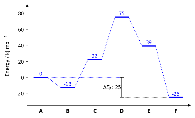
Energy difference bars
draw_difference_bar draws a vertical bar between two energy levels at a specified x-position, with optional horizontal whiskers to indicate the reference points for the difference.
dia = EnergyDiagram(style="halfboxed")
dia.draw_path(x_data=[0,1,2,3,4,5], y_data=[0,-13,22,75,39,-25], color="blue")

dia.draw_difference_bar(
    x=3,
    y_start_end=(-25, 0),
    description=r"$\Delta E_\mathrm{R}$: ",
    color="black",
    arrowstyle="|-|",               # arrow style (default: "|-|")
    x_whiskers=(5, 0),              # x-positions for whisker endpoints; None to omit
    whiskercolor="blue",            # whisker color (defaults to bar color if omitted)
    left_side=True,                 # place bar and text on the left of x
    add_difference=True,            # automatically append the difference value rounded to an integer to description
    fontsize=8,                     # font size for the label (uses diagram default if None)
    diff=None,                      # horizontal offset of text (auto-computed if None)
)
dia.bars[0].whisker_1.set_color("black") # Set the color of the first whisker of the firstly drawn bar to black

dia.set_xlabels(["A", "B", "C", "D", "E", "F"])
dia.add_numbers_auto()
dia.ax.set_ylabel("Energy / kJ mol$^{-1}$", fontsize=8)

dia.fig.savefig(os.path.join("..","docs","img","example_diffbar.png"),format="png", bbox_inches="tight")
dia.show()
Placing images
Single images
add_image_in_plot places a single image at an explicit position in data coordinates. SVG and EPS formats are not supported; PNG and JPEG work best.
# Single image at a fixed position
dia.add_image_in_plot(
    "path/to/image.png",
    position=(2, 30),               # (x, y) in data coordinates
    img_name="my_image",            # optional name to access the artist later via dia.images
    width=0.5,                      # width in axis units;
                                    # if omitted, height is used to scale or width is set automatically
    height=None,                    # height in axis units
    horizontal_alignment="center",  # "center", "left", or "right" relative to position
    vertical_alignment="center",    # "center", "top", or "bottom" relative to position
    framed=True,                    # draw a border rectangle around the image
    frame_color="black",            # color of the border
)
Example:
from chemdiagrams.templates.example_template import ExampleTemplate
import os.path

dia = EnergyDiagram(template=ExampleTemplate())

penguin = os.path.join("figures", "penguin.png")

dia.draw_path(
    [0, 1, 2, 3, 4], [0, 0.154, -0.382, -0.287, -0.748], "black",
)

dia.add_numbers_auto(
    n_decimals=2,
    fontsize=7,
)

dia.ax.set_ylabel(r"$\Delta E$ in eV", fontsize=8)
dia.set_xlabels(["Pengu@gas", "TS1", "Pengu@Cat", "TS2", "CO$_{2}$"], in_plot=True, rotation=90, fontsize=6, weight="normal")

dia.add_image_in_plot(
    penguin,
    position=(0.6, -0.4),
    height=0.4
)

dia.fig.savefig(os.path.join("..", "docs", "img", "title", "image_8.png"), dpi=300, bbox_inches="tight")
dia.fig.savefig(os.path.join("..","docs","img","example_single_image.png"),format="png", bbox_inches="tight")
dia.show()
Image series
add_image_series_in_plot places one image per reaction state, with automatic collision avoidance against energy numbers and x-axis labels. SVG and EPS formats are not supported; PNG and JPEG work best.
# Series of images distributed automatically along the diagram
dia.add_image_series_in_plot(
    ["img0.png", "img1.png", "img2.png", "img3.png", "img4.png"],
    img_x_places=[0, 1, 2, 3, 4],        # which x positions to place images at;
                                         # defaults to 0,1,2,... if omitted
    y_placement="auto",                  # "auto", "top", or "bottom" — can also be a list
                                         # per image, e.g. ["auto", "top", "auto", "bottom", "auto"]
                                         # "auto" automatically decides whether it is placed on top or bottom
    y_offsets=5,                         # additional vertical offset in data units, scalar or per-image list
    img_series_name="my_series",         # optional name to access artists later via dia.images
    width=0.6,                           # scalar applies to all; pass a list for per-image widths
                                         # if omitted, height is used to scale or width is set automatically
    height=None,                         # scalar applies to all; pass a list for per-image heights
    proportional_scaling=False,          # whether to scale width and height proportionally to the pixel dimensions of the images; also preserves size relations between images; default is False
    framed=False,                        # scalar or per-image list of bools
    frame_colors="black",                # scalar or per-image list of color strings
)
One very useful setting is proportional_scaling. If turned True (default is False), the width and height of all images is scaled proportionally to the respective pixel dimensions of the images, so that the relative aspect ratios and also the size ratios between images are preserved. With that option, it is sufficient to specify a single width or height for the whole series, and the largest image is scaled to that size while the others are scaled proportionally.
Example:
import os.path

ester_1 = os.path.join("figures", "ester_1.png")
ester_2 = os.path.join("figures", "ester_2.png")
ester_3 = os.path.join("figures", "ester_3.png")
ester_4 = os.path.join("figures", "ester_4.png")
ester_5 = os.path.join("figures", "ester_5.png")

dia = EnergyDiagram(
    style="borderless",
    extra_y_margin=(0, 0.25),
)

dia.draw_path(
    [0,1,2,3,4], [0, 32, 5, 25, -15], "blue",
    path_name="Blue path",
    linetypes=3
)

dia.add_numbers_average(color="black")
dia.set_xlabels(["Ester", "TS1", "Hemiacetal", "TS2", "Carboxylic\nAcid"], in_plot=True, fontsize=6, weight="normal")

dia.add_image_series_in_plot(
    [ester_1, ester_2, ester_3, ester_4, ester_5],
    y_placement="top",
    width=0.8,
    proportional_scaling=True,
    y_offsets=1.5,
    framed=[True, False, False, False, True],
    frame_colors="blue"
)

dia.ax.set_title("Ester hydrolysis", fontsize=10)
dia.show()
Accessing Matplotlib objects
All Matplotlib artists are accessible after drawing for direct customisation. Most importantly, the figure and axes objects are available as dia.fig and dia.ax for direct Matplotlib calls. This allows to set axis labels, titles, limits, or any other Matplotlib property before saving or showing the figure.
dia.draw_path(..., path_name="My Path")
dia.add_numbers_auto()
figure = dia.fig  # Matplotlib Figure object
axes = dia.ax     # Matplotlib Axes object
dia.ax.set_ylabel("Energy / kJ mol$^{-1}$", fontsize=10)
dia.fig.savefig("diagram.png", dpi=300, bbox_inches="tight")
dia.ax.set_title("My Energy Diagram", fontsize=12)
Artists for paths
All objects of a path (plateaus and connectors) are stored in dia.lines and can be accessed by the path name and x-position. If a path was drawn with width_plateau=0, it has no plateau objects.
# Plateau and connector lines
# Keys are x-position strings formatted to one decimal place
plateau   = dia.lines["My Path"].plateaus["2.0"]     # Plateau of "My Path" at x=2
connector = dia.lines["My Path"].connections["1.5"]  # Connector of "My Path" between x=1 and x=2 (x=1.5)
plateau.set_color("green")
connector.set_linestyle("--")
Via dia.lines it is also possible to access the path labels added with add_path_labels by their x-position.
path_labels = dia.lines["My Path"].labels["2.0"]       # Label of "My Path" at x=2
path_labels.set_color("blue")
Artists for numbers
All energy labels are stored in dia.numbers and can be accessed by path name and x-position.
# Energy labels
label = dia.numbers["My Path"]["2.0"]                # Number of "My Path" at x=2
label.set_color("red")
label.set_fontsize(12)
Artists for difference bars
Components of difference bars are stored in dia.bars and can be accessed by the order of bar placement (e.g., dia.bars[0] for the first one, dia.bars[1] for the second one...). A difference bar consists of the vertical bar (bar), an optional text label (text), and optional horizontal whiskers (whisker_1, whisker_2).
first_bar = dia.bars[0]                                 # First difference bar added to the diagram
first_bar.text.set_color("red")                         # Set the color of the text label of the first bar to red
first_bar.bar.arrow_patch.set_color("green")            # Set the color of the vertical bar of the first bar to green
first_bar.whisker_2.set_color("blue")                   # Set the color of the second whisker of the first bar to blue
Artists for axes, arrows and x-labels
Style objects for axes, arrows, and x-labels are stored in dia.ax_objects and can be accessed by their type and x-position (for x-labels). x-labels (x_labels) are only stored if they were created with set_xlabels(..., in_plot=True).
# Set color for x label at x=2.0
dia.ax_objects.x_labels["2.0"].set_color("purple")
Arrows (arrows) are stored by their name, which is "x_arrow" ("x_arrow_left" and "x_arrow_right" in case of style="twosided") or "y_arrow" for the axis arrows.
# Axis arrows (twosided/open/halfopen styles)
dia.ax_objects.arrows["x_arrow"].set_color("gray")
Axis break components are stored in xaxis_breaks and yaxis_breaks by their x or y position as a string formatted to one decimal place. Each break consists of two stopper lines (stopper_1, stopper_2) and a whitespace rectangle (whitespace) that covers the gap in the axis line. In case of "style=boxed" there are two break objects accessible via a dictionary keyed by "left" and "right" or "bottom" and "top".
# Axis break artists if style is not "boxed"
dia.ax_objects.xaxis_breaks["2.0"].stopper_1.set_color("red")
dia.ax_objects.yaxis_breaks["5.0"].whitespace.set_facecolor("lightyellow")

# Axis break artists if style is "boxed"
dia.ax_objects.xaxis_breaks["2.0"]["top"].stopper_1.set_color("red")
dia.ax_objects.yaxis_breaks["5.0"]["left"].stopper_1.set_color("blue")
The horizontal line when using diagram style "open" is stored as x_axis.
# Hide the horizontal line in hopen style
dia.ax_objects.axes["x_axis"].set_visible(False)
Artists for images
Images are stored in dia.images by their name, which is either the img_name passed to add_image_in_plot or the img_series_name passed to add_image_series_in_plot. The former is stored as an ImageObject, which has an image attribute for the Matplotlib AxesImage and a borders dictionary for the frame lines keyed by "top", "bottom", "left", and "right". The latter is stored as a dictionary keyed by x-position as a string formatted to one decimal place, with each entry being an ImageObject.
# Access a single image artist added with add_image_in_plot
img_object = dia.images["my_image"]                  # ImageObject
img_object.image.set_alpha(0.8)                      # AxesImage — any matplotlib imshow property
img_object.borders["top"].set_color("red")           # frame border lines, keyed by "top",
img_object.borders["left"].set_linewidth(2)          # "bottom", "top", "left", "right"

# Access images added with add_image_series_in_plot
series = dia.images["my_series"]                     # dict keyed by x-position as "x.x" string
img_at_x1 = series["1.0"]                            # ImageObject at x=1
img_at_x1.image.set_alpha(0.5)
img_at_x1.borders["bottom"].set_linestyle("--")